I redesigned a series of flyers for ABCD’s Fuel Assistance Programs to enhance clarity, accessibility, and visual appeal. The new designs improve readability, modernize the layout, and strengthen ABCD’s branding. By implementing a cohesive design system—including a unified color palette, structured formatting, and a clear typographic hierarchy—I created materials that are both professional and easy to navigate.
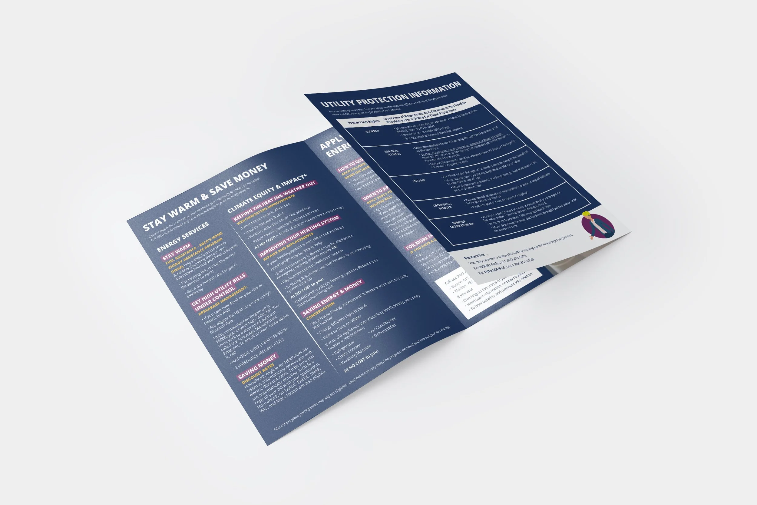
To make these resources more accessible to Boston’s diverse communities, the flyers were translated into multiple languages. In addition to the flyers, I also redesigned a large trifold brochure to complement this collection, further expanding the reach and effectiveness of ABCD’s outreach materials.
Below, you’ll find five redesigned flyers alongside their original versions, followed by the updated brochure at the end of the page.
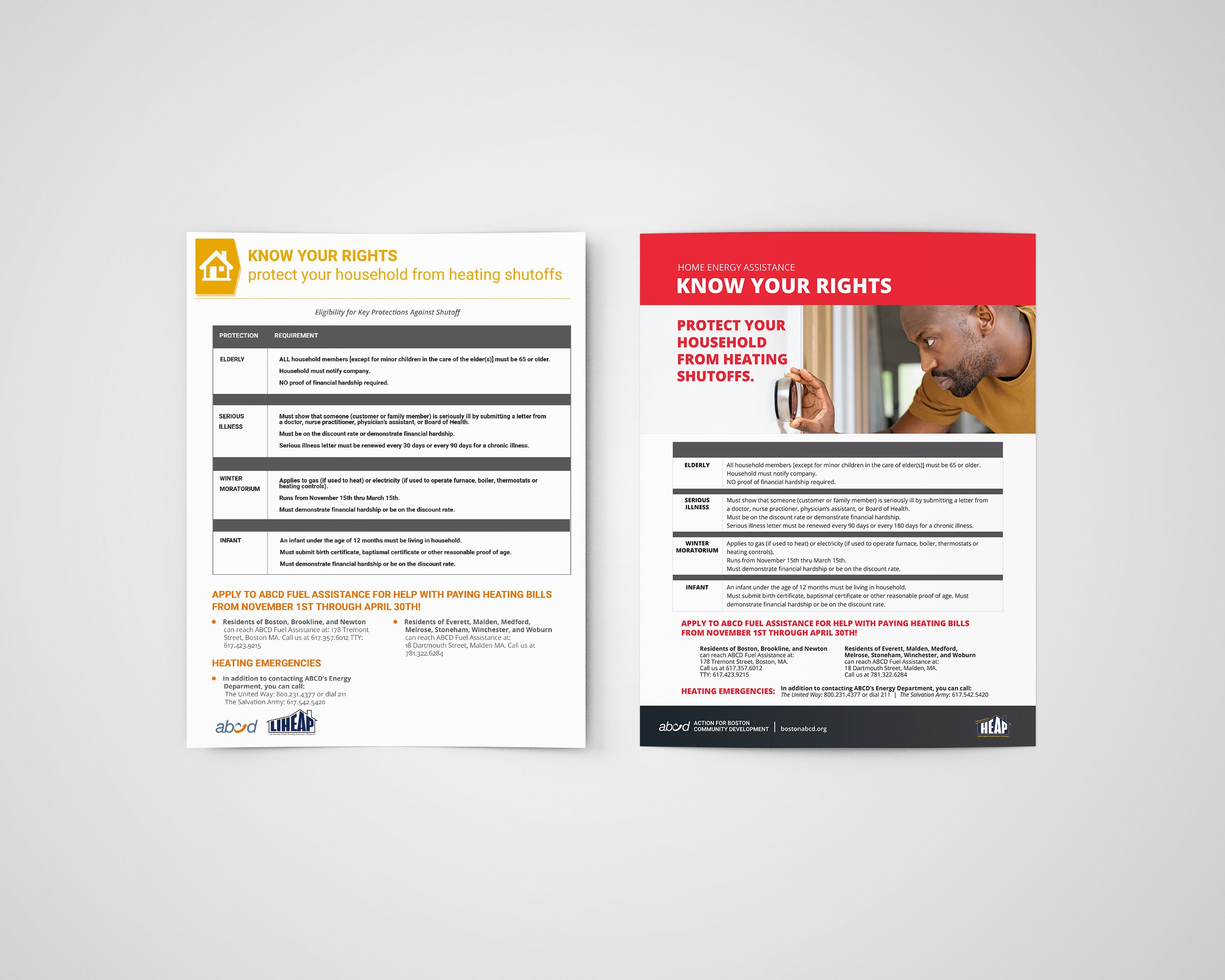


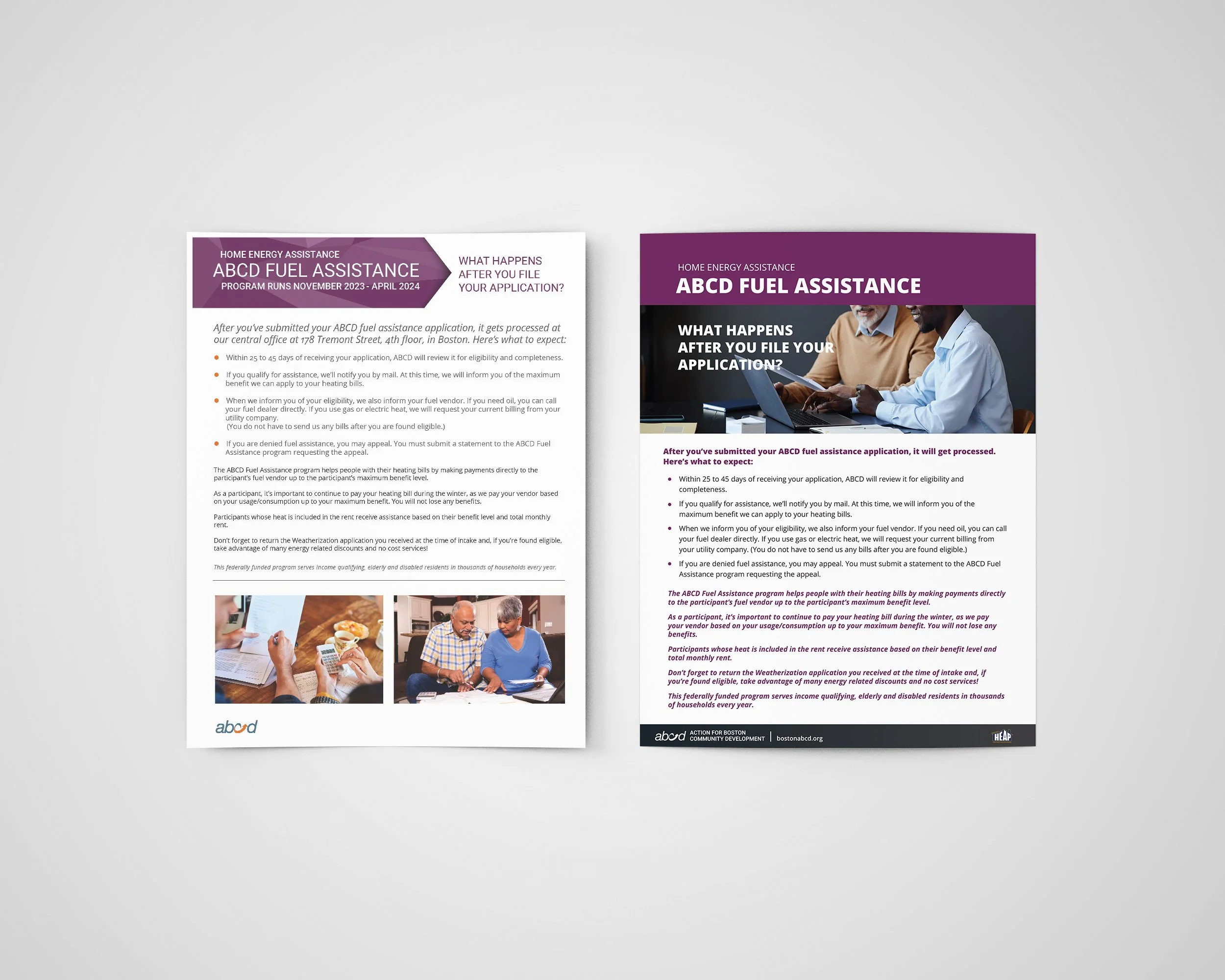

Old Version

New Version